See if this sounds familiar….
You create an AMAZING opt-in (valuable freebie/piece of content that you give in exchange for contact info) that you can’t wait to get out there to your community.
It checks all of the boxes: it speaks to your ideal client, offers valuable advice towards their transformation, and gives them a quick shot of results. More on how to do that here <<
But when you finally get your landing page up so that people can opt-in …
It’s CRICKETS.
Only a few of your most diehard current clients sign up to download it!
UGH.
It’s not your ebook that’s the problem.
#1. It could be your “traffic” (getting qualified eyeballs on your content). We’ll get to this in my next email … so stay tuned! OR …
#2. It could be your landing page. Getting it right is absolutely critical.
Your landing pages are some of the hardest working assets in your business! They work for you 24/7, and never take a day off.
I’ve put together a little checklist to help you pinpoint the KEY components of your landing page, so let’s get into it!
1. A HEADLINE that grabs your reader’s attention.
Keep your headline simple, easy to understand, and packed with action words. Most importantly, it has to connect with your ideal audience and clearly outline the MAIN BENEFIT of your content. A few examples:
- “15 Family-Favorite Recipes for Busy Moms & Dads Who Don’t Want to Spend Hours in the Kitchen”
- “5 Essential Exercises That’ll Strengthen Your Core … Without Doing a Single Crunch.”
- “Tired of Feeling Tired? Treat Yourself to a 5-Day Energy Reset!”
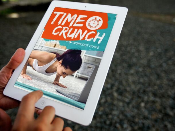
2. An eye-catching image. This could be as simple as screenshots of your ebook. Or it could be a photo of you – or a happy client who has made a transformation. Here’s an example of one we did this month that is included in our Content Club >>

3. Bullet Points of the BENEFITS/FEATURES – i.e., what makes it so awesome. (optional)
Why should they put their name and email on the form? What’s in it for THEM? The more specific you can be, the better!
Again, use action-oriented language that speaks to your ideal client.
Keep your copy short & sweet. The goal is to give them enough info so they feel confident signing up – but not so much that they feel overwhelmed.
A few examples (to go with the headline examples from above):
- Access Winning Budget-Friendly Recipes That All Contain 5 Ingredients or Less!
- Discover Why Crunches Could Be Dangerous … & What You Should Be Doing Instead
- Learn Our #1 Secret Hack to Boost Your Energy in 30-Seconds or Less
4. CLEAR Call to Action
Make sure your “download now” button is easy to find … and that it works!
The easier you can make it for them to download your free gift, the better.
Also, make sure there is only ONE call-to-action on your opt-in page. They shouldn’t be able to do anything else on that page …. except enter in their contact info!
Here’s a quick example:

Side note: I recommend testing your buttons on a regular basis to make sure they still work – tech can be weird sometimes and just stop working for no reason.
5. Use CREDIBILITY to Build Trust.
Can you add any reasons why they should learn from YOU?!
→ Have you been on the news? Featured in a magazine? Won any awards? Add greyed-out logos on the page or share a quick bit of info about it.
→ Have positive reviews or testimonials, grab some screenshots and add those, too! Social proof is KEY.
PHEW! How are you doing so far?
If you’ve already got a landing page up and running … check it against this list and see how you’re doing.
Remember the main reason you want to create this valuable content & opt-in isn’t just to get people on your list or grow your audience …
It’s to attract HIGH-QUALITY prospects that will be most likely to do business with you in the future … so that you can change more lives, make more of an impact, and crush your business goals.
Your opt-in flow is an ongoing process that you’ll refine and adapt over time as your business grows and evolves.
→ PRO TIP: Once you find a layout or format that works for you, save it as a template to use for future opt-ins, and just swap out your wording and images.
I use a proven template for my own opt-ins … and it’s also one I share in my Content Club, which is an organic content marketing program designed to help you grow & nurture your email list and social media community.
Learn more about The Content & Social Media Club here! <<
TONS more to come about content and conversions … so stay tuned!
Next up is how to get more qualified eyes on your content … and you don’t want to miss it!
Make it an amazing day,
Alicia
